New Nokia Logo, Explained
Almost 15 years ago, when I was a young man and a newbie technology blogger,
Finnish Tech Titan Nokia took its chance on me and gave me big breaks to get my name
out there. The people behind the brand truly lifted me up and gave TechPinas
its wings. This is why Nokia will always be close to my heart, unconditionally.
I've seen Nokia at its strongest as a phone brand and I've also witnessed it
struggle during those rough transitional years from the Symbian Era to the
Windows Phone Era. Through it all, in the highs and in the lows, I remained loyal
and hoped for the best for the brand.
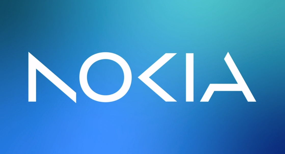
Honestly, when I saw Nokia's new logo which was formally unveiled at
Mobile World Congress 2023 in Barcelona, I found the new design a bit
odd and baffling. I can't say I'm in love with it. Nevertheless, I was happy
to see that Nokia is finally embracing a new era in its long history. I just
hope that this rebrand signals great things to come for the tech
company.

The New Nokia Logo, which was officially unveiled by the company at Mobile World Congress in Barcelona Spain on February 28, 2023.
Yes, Nokia has just introduced a new brand identity with a revised logo after 60 years,
marking the first such change. The purpose of this change is to alter people's
perception of Nokia from a mobile phone enterprise, which is how it is still widely viewed, to a B2B technology and
innovation firm.
According to Ms. Melissa Schoeb, Nokia's Chief Corporate Affairs
Office, "This is a bold step in Nokia’s journey – and will help us get
recognized by existing and prospective customers for the B2B technology
innovation leader we are today.”
Ms. Stacey Brierley - Nokia's Vice President for Brand - added,
"Our new logo is a bold evolution of the 1960s classic. It’s dynamic,
precise and brings new meaning, cleverly representing our purpose with
abstracted letters that, when acting together, read as Nokia."

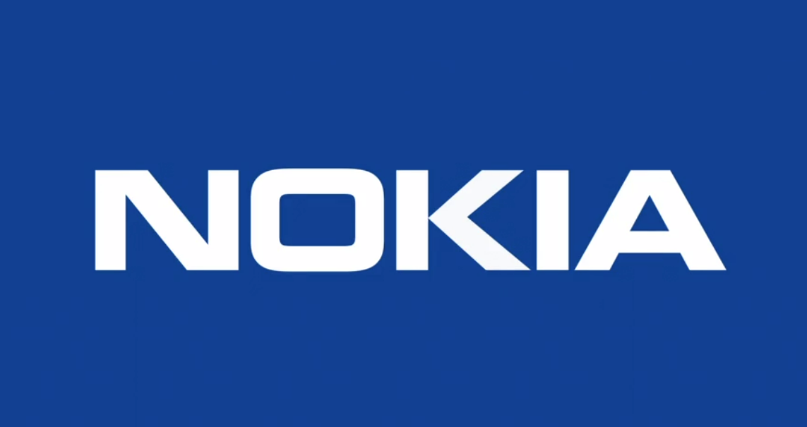
The Classic Nokia Logo, which was used by the company for a whopping 60 years.
The updated logo of Nokia has abandoned the traditional Nokia typeface and
adopted a more abstract and geometric style. The goal of this simplification
is to maintain the iconic logo's instant recognizability while achieving the
appropriate level of visual development. However, as a result, the individual
letters of the word "Nokia" have been significantly simplified and reduced,
resulting in a distant resemblance to the previous logo.

If there are individuals who still miss the old logo, they should know that
HMD Global has owned Nokia's mobile phone division since 2017 and holds the
rights to use the Nokia brand name for its own mobile phones. It is currently
unknown whether HMD Global will use this new logo, implying that there may be
two distinct Nokia logos in circulation for the time being.


